Hello Fresh
RECIPE DETAIL - UX / UI REDESIGN
Turning a single HelloFresh recipe page into a calm, confident cooking companion for busy weeknights — without changing the brand, the ingredients, or the copy.

Why Redesign a Single Recipe Page?
Overview
HelloFresh offers hundreds of rotating recipes each week, but once users land on the recipe detail page the experience becomes mostly text-heavy and linear. Long paragraphs, small type, and separated media make it hard for busy home cooks to follow along while juggling real life — kids, partners, notifications, and a timer that’s already beeping.
This sprint explored how a single recipe page could better support the reality of weeknight cooking: split attention, time pressure, and limited mental bandwidth. My goal was to redesign the experience so it feels like a steady companion at the counter, not another thing to manage.
Guiding question:
How might we turn one HelloFresh recipe page into an easy, confident cooking experience — without changing the brand voice or the underlying content?
Design Focus
Platform: Recipe detail page (responsive)
Primary user: Returning HelloFresh customers cooking on a busy weekday evening.
Constraints: Keep existing copy & photography; respect HelloFresh visual identity.

PROJECT OVERVIEW
What Wasn’t Working?
Instructions were presented as long paragraphs instead of scannable steps.
Key actions like preheating the oven or starting rice were easy to miss.
Video, ingredients, and steps felt visually disconnected.
No clear sense of “where I am” in the recipe or how long is left.
Cooking while watching TV or chatting meant users frequently lost their place.
Problem & Heuristic Findings


Role
UX / UI Designer
Duration
1 Day
Team
Solo design, workshop collaborators
Tools
Figma, Miro, ChatGPT, Photoshop, Gemini


Before
Instructions are long paragraphs, making it hard to scan while cooking.
Prep time, cook time, and tools are scattered rather than grouped.
No strong sense of progress — users aren’t sure how far they are in the recipe.
Tips, substitutions, and dietary info are hidden below the fold.
Opportunity
Break the recipe into calm, bite-sized modules.
Keep the cook’s “next action” always visible.
Use visual hierarchy and iconography instead of more words.
Align the page with real-life multitasking and interruptions.
Design Question & Needs Framework
User Needs
Know exactly what to do right now in the kitchen.
Quickly recover when distracted by a show, partner, or child.
Trust that the recipe will turn out well, even when rushed.
Context Needs
Works on a tablet, laptop, or phone propped up on a crowded counter.
Readable from a distance, with wet or messy hands.
Supports starting, pausing, and resuming without losing context.
Design Needs
Respect HelloFresh’s brand voice and visual identity.
Stay compatible with existing recipe content and CMS structures.
Create modules flexible enough to reuse for future recipes.
Persona
Meet Lena — The Weeknight Juggler
To ground the redesign, I used AI-assisted persona prompts from the workshop framework, then refined the results manually.
Profile
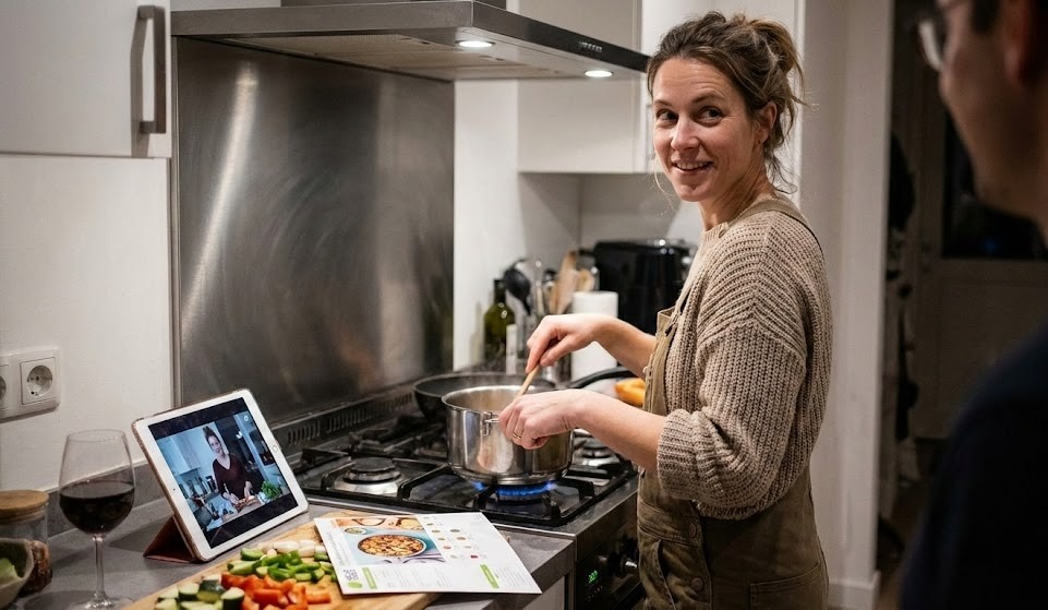
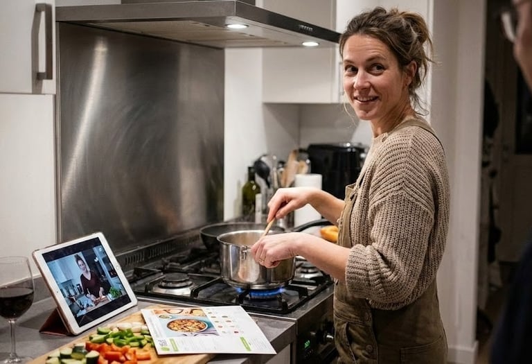
Lena is a 35-year-old professional who cooks HelloFresh 3–4 nights a week. She often starts dinner after work while catching up on a show or talking with her partner. She’s comfortable in the kitchen but doesn’t want cooking to feel like another project.
Goals: Get dinner on the table in ~30–40 minutes without stress; feel confident the meal will turn out well.
Pain points: Losing her place when she looks away, scrolling up and down to find the next step, forgetting time-sensitive tasks.
Key needs: A recipe that acts like a calm guide: clear, forgiving, and easy to resume after interruptions.
Scenario & Evening Journey
A Cozy Weeknight in Lena’s Kitchen
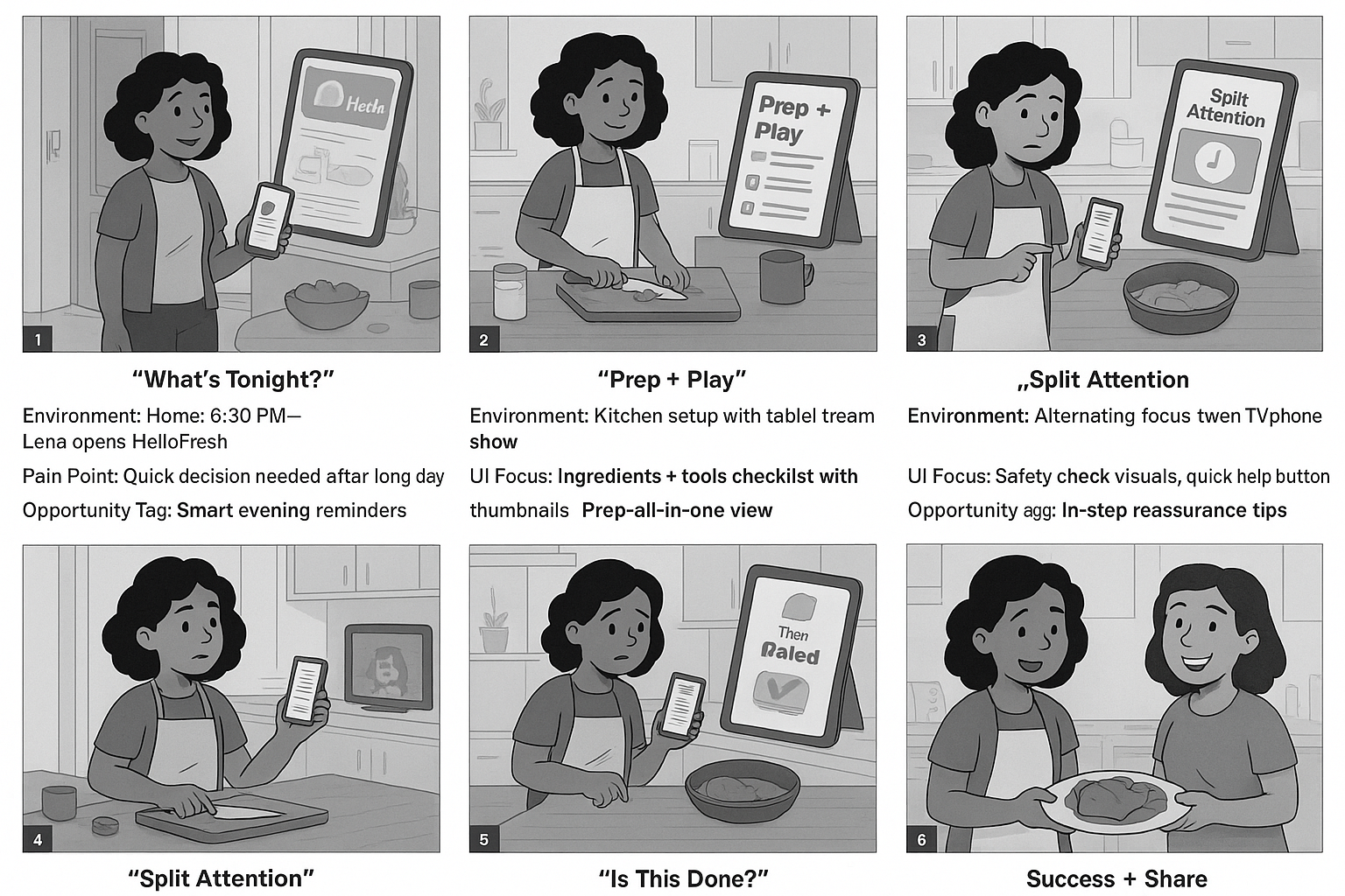
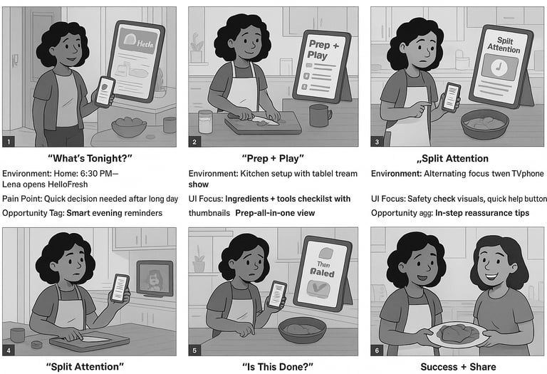
I mapped Lena’s evening as a short storyboard using the workshop’s “story then journey” method. The goal was to understand how attention moves between the screen, the stove, and everything else happening at home.
“What’s tonight?” · 6:15pm, Lena opens the app to pick a recipe.
“Prep & play” · She chops vegetables while watching her show.
“Split attention” · Timers beep, sauce simmers, someone texts her.
“Is this done?” · She double-checks doneness cues and plating.
“Success + share” · She snaps a photo and saves the recipe.
Insights & Design Principles
Key insights
Users treat the recipe detail page as a control center, not a blog post — they scan, act, glance, and return.
Confidence drops whenever there’s a mismatch between what they see on screen and what’s happening in the pan.
The most stressful moments happen when multiple timers, ingredients, and distractions collide.
Design Principles
Designing for Comfort
Inspired by the workshop, I framed the design principles as tensions rather than rules — to guide decisions when trade-offs appeared.
Guided vs. Overwhelming: Show just enough detail per step, with the option to expand.
Cozy vs. Clinical: Keep the layout clean and functional, but warm with photography and tone.
Predictable vs. Flexible: Maintain a consistent structure while allowing safe swaps and timing tips.
Static vs. Conversational: Treat the page as a gentle back-and-forth, not a recipe dump.
Modular AI
Breaking the Recipe into Modules
Rather than designing a “page,” I defined a set of reusable modules that could apply to any recipe, following the workshop’s module-first approach.
Core Modules
Recipe Hero (title, tags, difficulty, rating).
At-a-Glance Bar (total time, servings, tools, calories).
Ingredient Grid (grouped by step or station).
Step Cards (photo + instruction + mini-timer + checkmark).
Chef Tips & Swaps (inline with relevant steps).
Nutrition & Allergens (summarized, expandable).
Updated Recipe Layout
Above the fold: hero image + at-a-glance + starting CTA “Start cooking”.
Sticky step navigation: current step highlighted for quick orientation.
Visual progress: completed steps dim slightly with a checkmark.
Optional “quiet mode” layout for tablet/desktop use while cooking.
DISCOVER
Low-Fidelity Layout for Cooking Reality
I started with quick wireframes (hand sketches interpreted with AI, then refined in Figma to focus on hierarchy and flow which information needs to stay “above the mess” when things get chaotic?
Hero summary with a single glanceable promise.
Ingredients pinned near the steps instead of living in a separate column.
Prominent “current step” card that stays visible while scrolling.
Large tappable areas and generous whitespace for readability from afar.


High-Fidelity Layout for Cooking Reality
The New Recipe Experience
In the high-fidelity phase I combined HelloFresh’s bold photography with a softer UI that highlights what matters in the moment: the current step, time remaining, and what success looks like.
Persistent step header anchored at the top with progress dots and a “time left in this step” indicator.
Inline timers that can be started from the step itself instead of jumping to another screen.
Doneness cues written in plain language (“edges browned, center still slightly jiggly”).
Subtle green accents (HelloFresh brand color) used to confirm positive actions and completion


Develop
Usability Test And Iteration
I ran rapid, think-aloud tests with four HelloFresh users who regularly cook from online recipes. Each participant was asked to “cook” through the main dish using the redesigned page while narrating.
Most participants immediately noticed the clearer structure and used the step stack as their primary anchor.
Several still missed early oven preheat cues in the first version.
Users loved inline timers but wanted a clearer way to check all timers at once.


Key Findings
Users often forgot a prep step when scanning too quickly.
Some felt unsure if they had “completed” a step correctly.
Certain modules were noticed more on desktop than on mobile.
Iterations
Added stronger visual emphasis on “setup” tasks before Step 1.
Introduced completion checkmarks and microcopy (“You’re ready for the oven now.”).
Created a compact timer tray so users can see all active timers in one glance.
−25%
Average time spent searching for the next step.
+35%
Participants reporting “very clear” recipe instructions.
+40%
Increase in perceived confidence while cooking.


Iteration 1. Static Modal With Full Recipe (Left Image)
In the first version, the cooking experience lived inside a single scrollable modal. Users could read all ingredients and steps at once, but this design surfaced several issues:
Problems
Loss of Focus:
With all steps shown together, users had to constantly re-find where they left off.Cognitive Overload:
A long list of instructions looked more like a PDF than an interactive cooking assistant.Poor in Real Kitchens:
Users needed to scroll with messy hands, making the flow inconvenient and error-prone.Emotionally Flat:
The design delivered information, but not presence — it didn’t feel like a companion guiding you.
User Feedback Themes
“I keep losing my place.”
“It feels like homework, not cooking.”
“I wish it walked me through step by step.”
Iteration 2.Immersive Step-by-Step Cooking Mode (Right Image)
The second version transformed the recipe into an immersive guided flow, pairing each step with a visual, a clear title, and a calming emotional cue.
Improvements
One Clear Action at a Time:
Only one step is visible, reducing mental load and helping users stay in flow.Strong Wayfinding:
Step indicators (“Step 1 of 6”) show progress and give users confidence.Emotionally Supportive:
Motivational microcopy (“The Calm Before the Heat”) and sensory cues support the emotional cooking experience.Hands-Free Friendly:
Large “Next” button makes it easy to progress while cooking.Narrative Rhythm:
Each step becomes a moment — not a task buried in a long list.
User Feedback Themes
“It feels like the app is cooking with me.”
“Much easier to follow — I don’t lose my spot.”
“The step-by-step pacing matches how I actually cook.”
Deliver
Final Prototype
In this section, you can check out the complete final prototype.

What I learned
Starting with a sharp design question (“one recipe page”) made it easier to prioritize and say no to extra features.
Thinking in modules rather than pages protects the design from future content changes and new recipe types.
AI is powerful for visual exploration and mood boarding, but human judgment is essential for clarity and tone.
Designing for split attention is less about adding features and more about helping users feel calm, capable, and in control.
Next Steps
Test this layout with real HelloFresh subscribers over a full week of cooking.
Extend the modular system to cover side dishes, desserts, and add-ons.
Investigate how the design could integrate with grocery apps or smart devices.
Collaborate with content strategists to refine narrative voice for different skill levels (beginner vs. confident cook).


